


the health strategist
institute for continuous transformation
of health systems
and digital health
Joaquim Cardoso MSc.
Founder and CEO
Education:
Engineering (BSc Post Graduation), Administration (MSc.), Technology (MSc thesis)
Experience:
Researcher, Professor, Editor and Consultant (Senior Advisor)
October 1, 2023
Introduction by
Roberta Boscolo
Climate & Energy Leader at WMO | Climate Science & Policy Expert | Sustainable Energy Advocate
The Copernicus ECMWF hashtag#ClimateChange Service has developed a tool which monitors the evolution of global air temperature over the last decades up to the present and estimates the date when global warming will reach the 1.5°C limit set by the hashtag#ParisAgreement
The application is first and foremost a monitoring tool and the indicative future date is there for illustrative purposes only and should not be interpreted as a forecast.
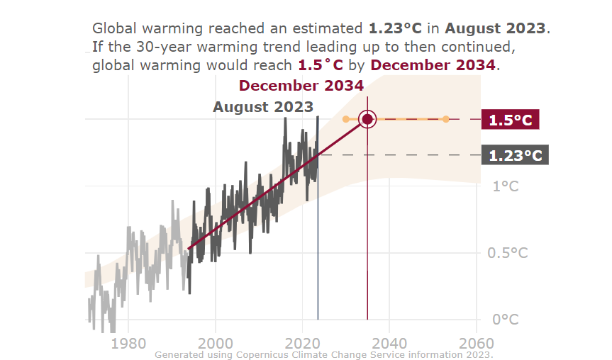
The plot shows:
- in solid light and dark grey, the monthly average temperature anomalies, with respect to pre-industrial era, up to the month selected via the provided slider
- the dark grey line shows values corresponding to the 30 years before the selected month, while the light grey line represents the remaining values back to the first (January 1979) and up to the most recent available month;
- a solid red line, with the linear global temperature trend calculated from the values of the thirty-year period up until the selected month (the period is indicated by dark grey monthly values)
- a red circle and a thin vertical red dashed line mark the point where the trend intersects the horizontal dashed redline that represents a global warming increase of 1.5°C, indicated by the red box;
– a vertical thin grey line placed at the selected month;
– a horizontal dashed grey line and grey box, mark the point and the corresponding global warming estimate where the trend line intersect the vertical thin grey line placed at the selected month;
- Sentences at the top left of the plot, indicate the global warming estimate and the corresponding date of the two intersections of the trend line, as described above;
- an orange shaded area represents the uncertainty associated with both past values of and future climate projections of global warming, as reported in the summary for policymakers of the 2018 IPCC special report “Global Warming of 1.5°C”.
- an orange line indicate the associated IPCC ‘likely’ estimate of the time interval during which global warming will reach 1.5°C above pre-industrial
Global warming — a limit agreed under the Paris agreement — may feel like a very distant reality, but it might be closer than you think.
Experts suggest it is likely to happen between 2030 and the early 2050s.
See where we are now and how soon we would reach the limit if the warming continued at today’s pace.
In this application:
- “Global warming” at a point in time refers to the increase in a 30-year average, centred on the specified time, of Earth’s global surface temperature relative to the pre-industrial period;
- “Reaching the limit” refers to the moment when the central time of the 30-year average temperature equals 1.5˚C above pre-industrial values;
- “Pre-industrial values” refers to the approximation of the surface air temperature of this era from the IPCC ‘Global warming of 1.5°C’ report.
The application is first and foremost a monitoring tool and the indicative future date is there for illustrative purposes only and should not be interpreted as a forecast (see page 13 of documentation).
Limitations of the method [excerpt of the documentation report]
The simple model here is not intended as a prediction, rather it serves to illustrate the simplest yet still plausible model for how global warming may evolve in the coming years and decades. Introducing further datasets and slightly different methods for estimating the trend would slightly affect the numbers shown, but would not change the fact that the model is a simplification and that a more complex model is needed to encompass the full uncertainty envelope. The envelope given by the projections (indicated in beige shading), as well as the ‘likely’ estimate based on those, as indicated by the orange bar, taken from the IPCC 1.5°C report are indicative of the level of uncertainty associated with making such a prediction. The following illustrates how the ‘global warming estimate’ and the trend estimates would be affected by using other global temperature datasets. The datasets have been extracted as outlined in Simmons et al. (2021).
Taking the trends based on the 30 years ending in December 2018, and using the December 2019 “global warming” estimate as given by the application (1.10°C), the estimated time at which the 1.5°C would be reached would differ from September 2037 for the highest estimate for the trend to October 2039 for the lowest estimate for the trend, i.e. a difference of 2 years and 1 month.
Further, using one dataset (ERA5) and the same date, but just varying the “global warming” estimate by the ±0.06°C 5–95% range (see section 2.3), the difference between the two resulting time estimates is 5 years and 6 months.
The above illustrates the uncertainty of some of the components of the simple model behind the application, but as previously stated it does not show the full uncertainty associated with when global warming will bypass the 1.5°C target limit. For further comparisons between ERA5 and other global temperature datasets, e.g. at the monthly time scale, see Simmons et al., (2021).
Concluding Remarks [excerpt of the documentation report]
This application allows the user to explore and understand the current rate of global warming, what is the current state of global surface air temperatures and a likely time-span within which the 1.5°C limit will be reached if the current temperature increase continues at the same pace as at present. At the same time it exposes the user to the fact that this simple method of estimating the date this limit will be reached is inherently uncertain, highlighted by the large difference in the estimated date when using the date slider to change the time period that is used as a basis for the estimation. The application is first and foremost a monitoring tool and the indicative future date is there for illustrative purposes only and should not be interpreted as a forecast. Further, the application is based on only one dataset estimating the observed change in global surface air temperature. Using other or a combination of other datasets, another method for estimating the trend or another estimate for the change between the pre-industrial period and the 1981–2010 reference period would result in somewhat different estimates, both for the global warming at a certain point in time, as well as for the date at which the 1.5°C limit would be reached. Nevertheless, the underlying message and exploration possibilities for the user would not change significantly if any of the above were to be implemented differently.
Source
https://cds.climate.copernicus.eu/cdsapp#!/software/app-c3s-global-temperature-trend-monitor?tab=doc
Source


